11.Flyer made with Photoshop
In this assignment we used Photoshop to create this flyer for the clubs that we were in. In this flyer we used tools such as stroke to make this font more creative. I used a gradient background to create a well designed background. I used a regular font to write descriptions about the club like where its located and when etc.
12: Suit Color Dodge
In this assignment we used Photoshop to make a regular suit as shown to the right of the picture to become a custom suit used with a custom design in the middle and the final product to the left. We went to Google images to get the images of the suit and designs that we would put on it. After that we used the Polygon Lasso tool to go over the suit and put in the design on the suit then hid the layer to customize more of the suit. After that we used a clipping mask for the design so it would go with the design of the suit and changed it from normal to color dodge and added the rest of the original pictures.
13: Mimicking the Change one thing POSTER
In this assignment we used the software Photoshop to make this poster. To start off the assignment I applied a gradient background. I then went to Google images to get a picture of a Dunkin' Donuts box and a picture of grapes, which would replace the donuts. I used the lasso to delete the donuts. After that, I put the grapes where the donuts were and then added the NYC food bank logo. Then i used the outer glow to add effect to the pictures. In the end I researched the benefits of eating grapes and added them to the poster
14a.: Flag Displacement
In this assignment we used Photoshop to make this flag blend into a brick wall. To do this we had to search up an image of a flag and a brick wall . We then arranged the pictures on Photoshop and used hard light to make them more visible. We duplicated the brick layer so it can be more detailed and used Ctrl + Shift+ u to desaturate the layer. We blurred out the filter and finished it off by changing the opacity to 50%.
14b: Face Displacement
In this assignment we used Photoshop to make a flag blend onto a person's face. To do this we used image of someone and an image of a flag. After that we arranged the pictures and used hard light so it would become more visible. We duplicated the picture of someone and desaturated the layer. We blurred out the filter and put the opacity to 50%. Exactly the way we did in assignment 4a.
15: Smart Filtering with Motion Blur
In this assignment we used Photoshop to make the picture seem as if it was actually moving. To do this we went to google images and searched for a car with a background. After that, we opened it in Photoshop and opened it as smart object and added the filters and painted in the car so it would seem like it was moving. We then doubled the canvas size to put the original next to the new modified version and our name with the text box.
Q: why smart filter? what is the difference between normal and smart filter?
A: We used smart filter so that it would have a motion blur to the background and wouldn't mess with any pixel data. The difference between a normal filter and a smart filter is that smart filters have more adjustments without ruining any pixel data.
16: Quick Masking to add a desire effect
In this assignment to use eyes and customize it to what we desire. We went to Google images and searched for a picture of eyes and we used quick masking to make it to what we wanted it to be. During the the assignment we took a picture of our progress as a during part. Lastly we added all of the pictures together.
Q:
what is quick Masking? why bother if I can just select with marquees or lasso tool?
A: Quick Mask is a mode on Photoshop that lets you create a ready-made mask which you can edit or even turn into a selection by painting with a black or a white color. In quick masking you can capture all kinds of small details unlike the lasso tool etc.
17: Soft Skin Filters
In this Assignment we used Photoshop to add a soft focus effect to add more effect to the skin. We used google images to search for a picture of a woman and then we added more effects so her skin would look soft as if it was glowing.
Q: we added a couple of things to the original picture to get this "glow" - what were the they? and what and at what layer did you take away to create the final effect?
A: We added the filter, motion blur and changed the opacity from 100 to a lower percent. The layer we took away was the copy of the background layer.
18: USB drive
In this assignment we used adobe illustrator to make this flash drive. We went through multiple steps to make all these shapes into a form of a flash drive. And by using gradients we made this flash drive look very unique and colorful.
19a: Last name Illustrator
In this assignment we used adobe illustrator to make our last name out of lines and a different variety of shapes. We start using stuff like the line segment tool, arc tool, rectangle tool, etc. We made boxes so that the name would come out straight and after that we took it out making our name look customized with different line tools and shapes.
19b: Preparation for Test
In this assignment, we went through 4 steps. Step 1: We had to make 2 rectangles, a rounded rectangle and a circle covering it. Step 2: We used pathfinder and the minus front to erase the circle but leave its outline on the rounded rectangle. Step 3: we put a rectangle going horizontal and we used path finder to divide the shapes which were both selected. Step 4: We used the white arrow to to select the rectangle and delete it.
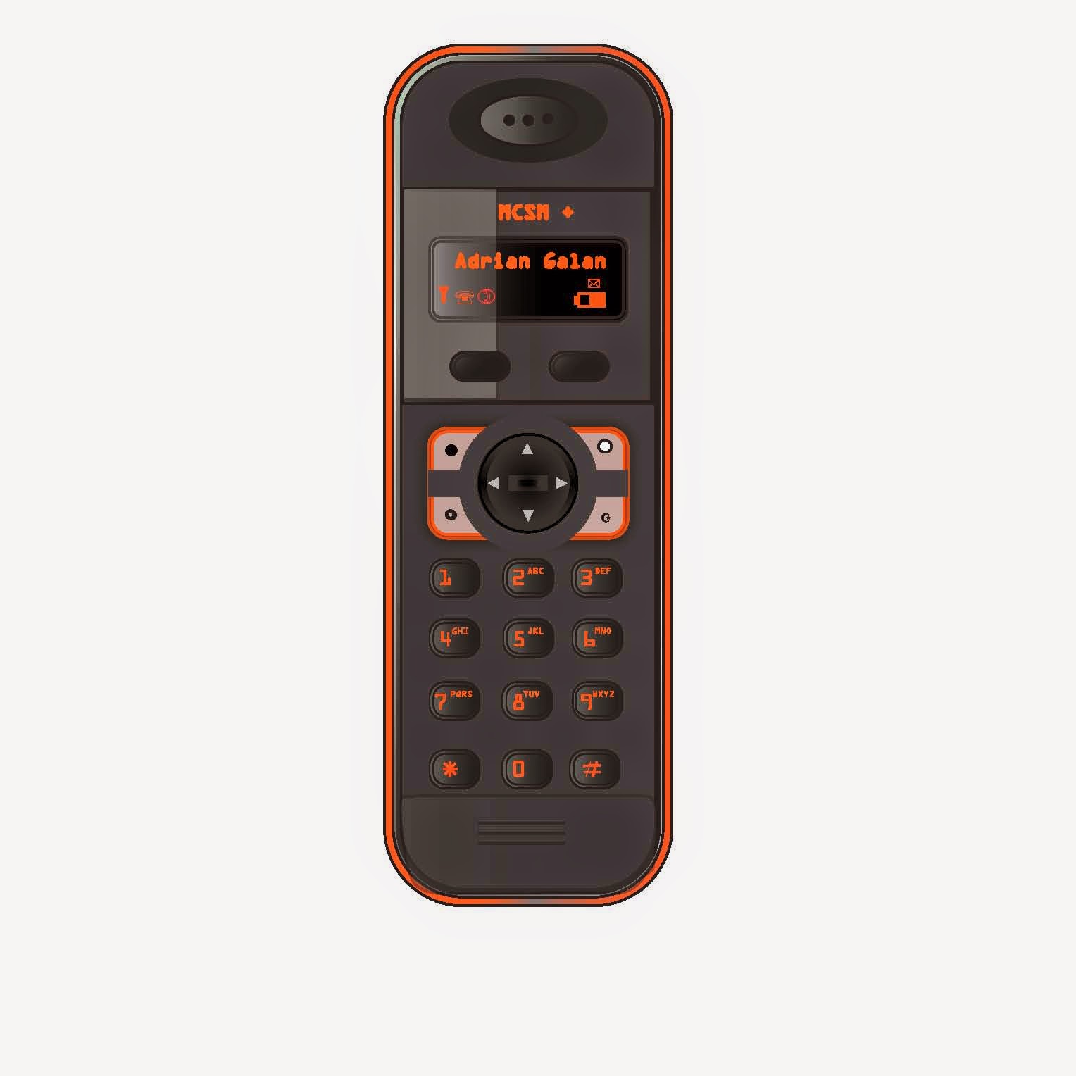
20: Phone (test)

In this assignment we made a phone out of different shapes, fonts, and fonts to fit the theme of the phone. We followed a variety of steps to make this phone. We used Offset Path and various gradients to create a three dimensional phone with a realistic highlight and reflections. We used shapes like rounded rectangles and circles to make things such as the base of the wireless phone and as shown above, the three circles which would be where the individual would listen to the other person speak. We also made more designs to make the phone more realistic. Day 1 we created shapes and gradients to start our main structure of the phone. Day 2 we used differnet tools like opacity so the left side of the phones' screen would be brightened. We also started to make the 2 buttons on the screen and the font inside the screen of the phone. Day 3 we built the shape of the key pad and used gradients and different shapes to fill it in as well as path and offset path to create a 3-D effect on the buttons. Day 4 we started to fill in the rest of the buttons which would eventually have different objects on them and numbers as well. Day 5 we made the 3 circles on top as well as the inside and used the offset path to make it have a 3-D effect and to show that it would be where the person would listen. We finished the phone after by saving it as a ai. and a jpeg.
2nd Marking Period Reflection
In the second marking period we used Adobe Illustrator for many assignments. We used many different customization to create a variety of objects to make it seem as if it was real. We made things like flash drives, phones, face displacements etc. I believe that I deserve at the least a 90 because, I show up everyday, on time, I do all my work, and I always help out when other peers need assistance. A 100 would be fine to but its up to you :).


.jpg)


.jpg)


.jpg)
.jpg)
.jpg)
.jpg)
.jpg)
.jpg)


